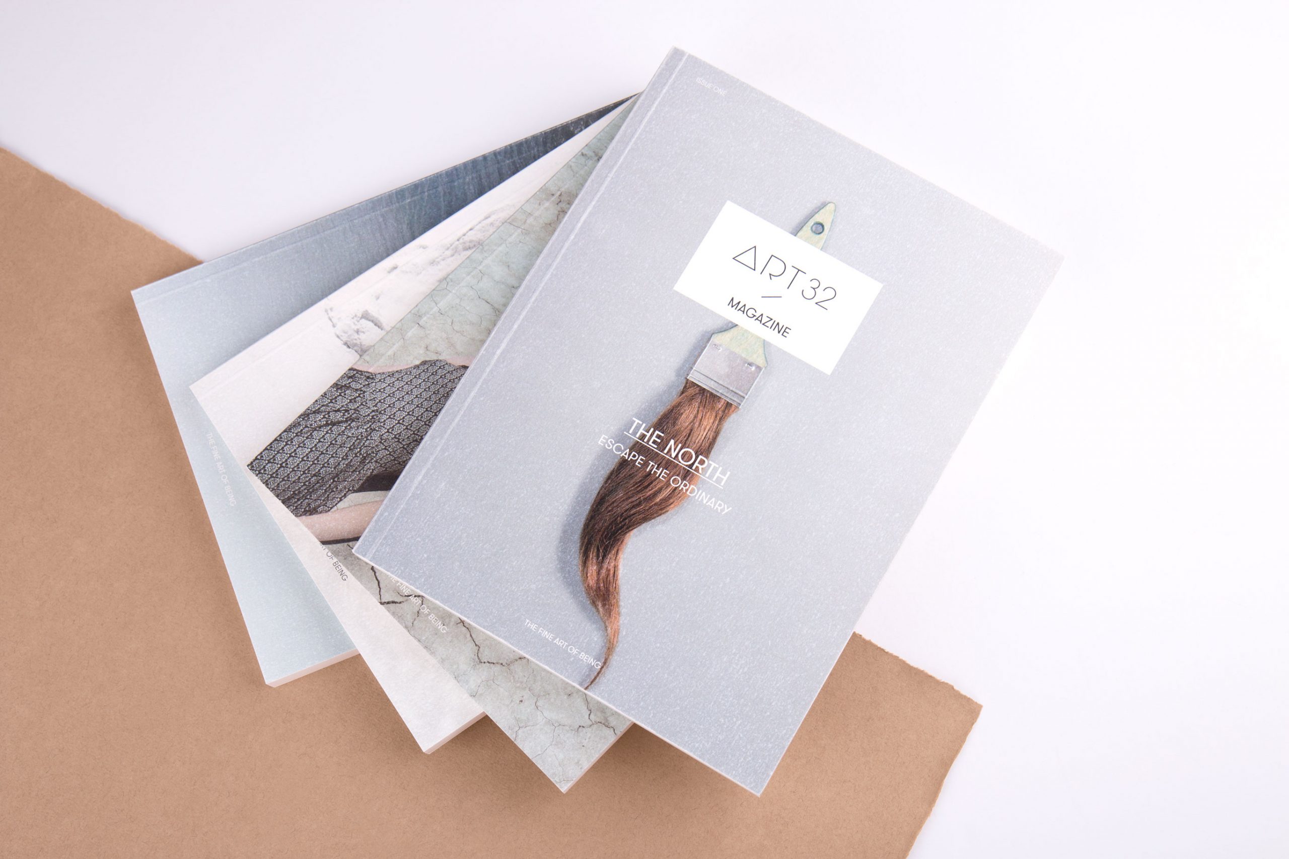
Wir waren uns von Beginn an einig: Der neue visuelle Markenauftritt von Art 32 sollte hell, reduziert und filigran sein. Ganz so wie die Galerie selbst – getragen von einer durchgängigen Leichtigkeit des Seins. Mit diesem Briefing entwickelten wir »the fine art of being«.
Art 32.
The fine art of being
Unsere Leistungen
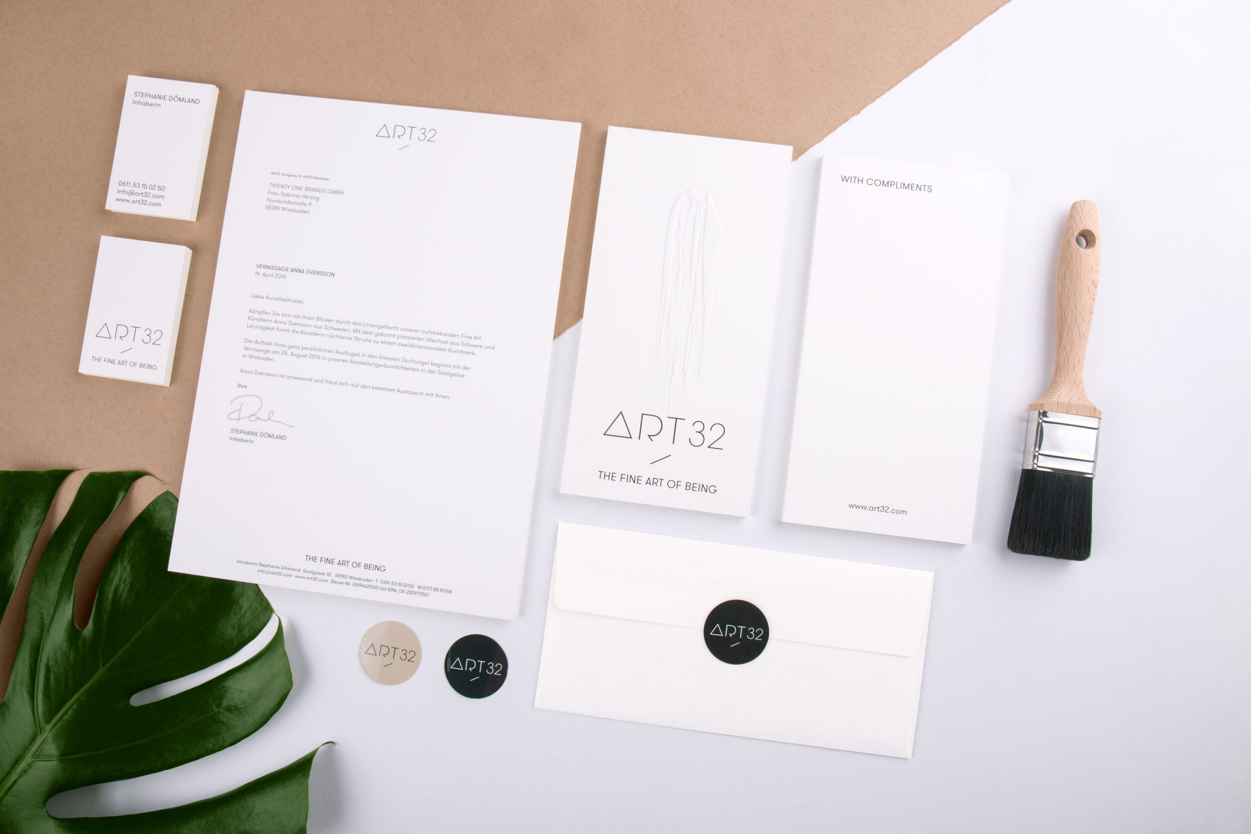
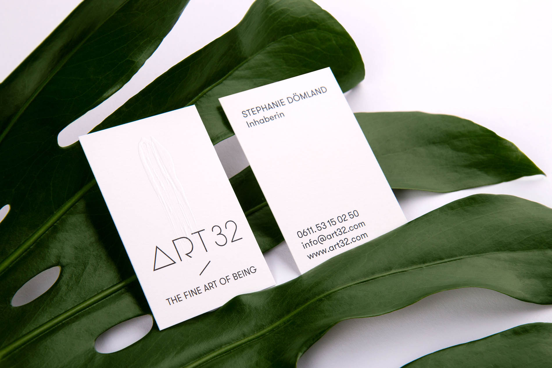
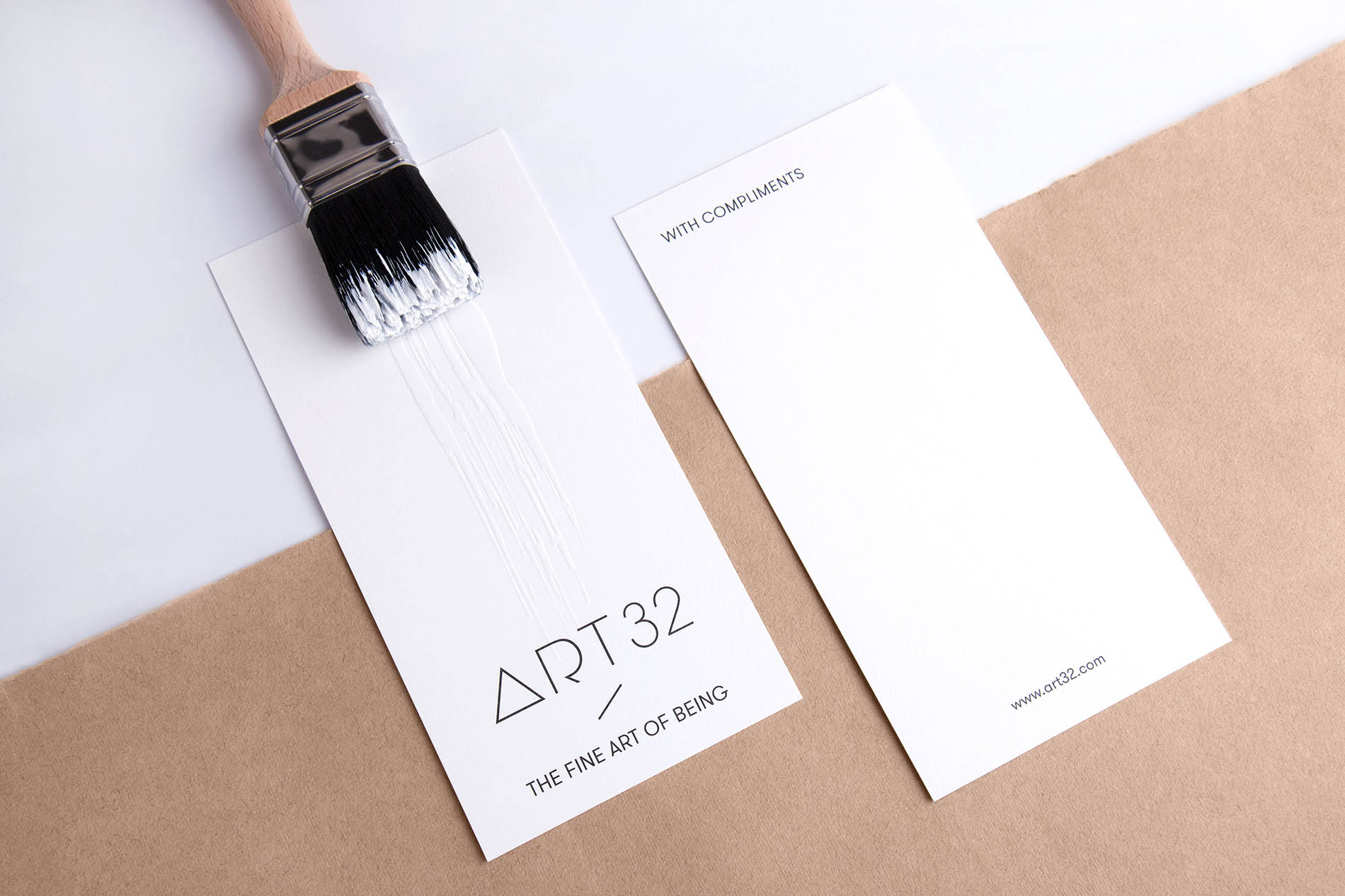
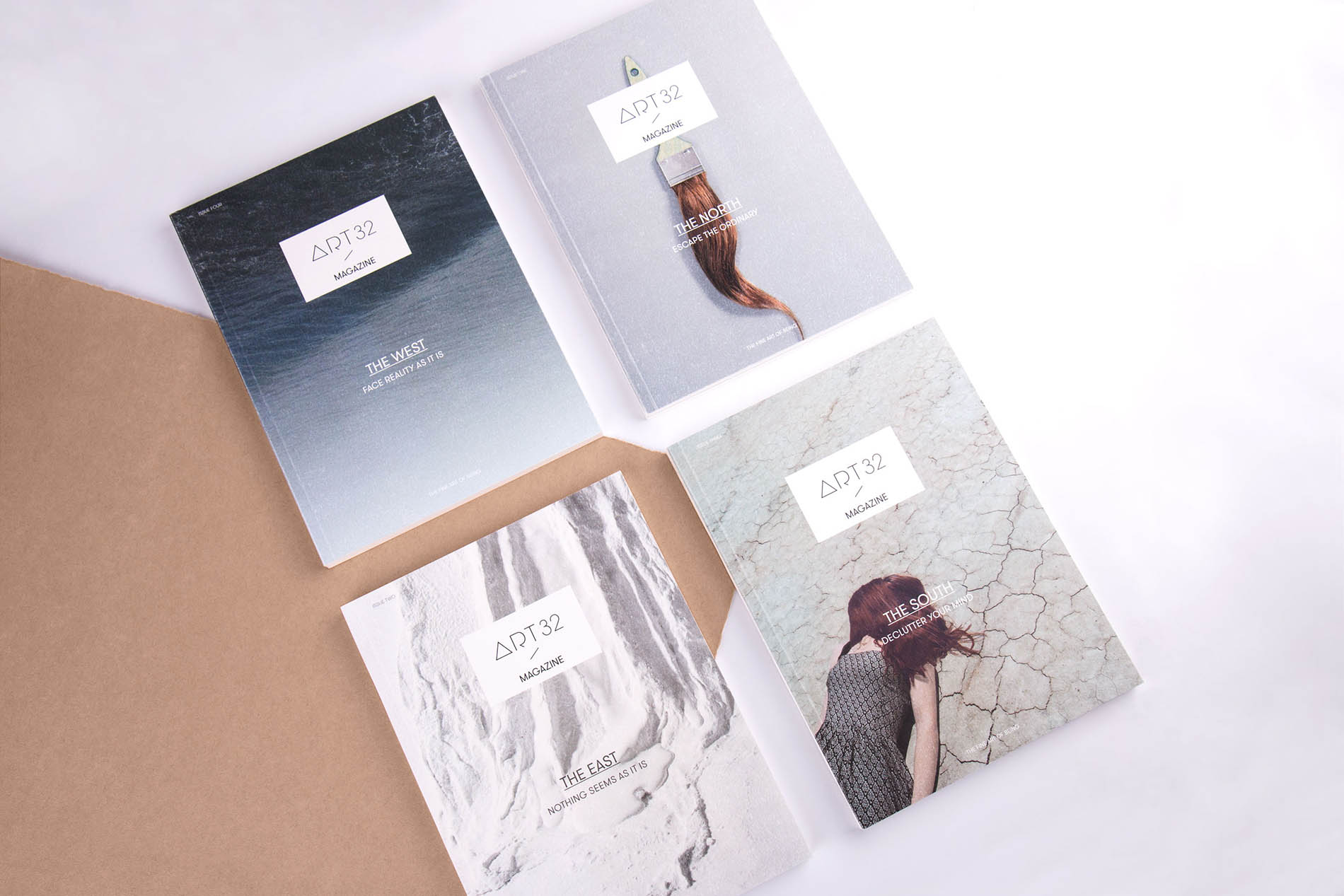
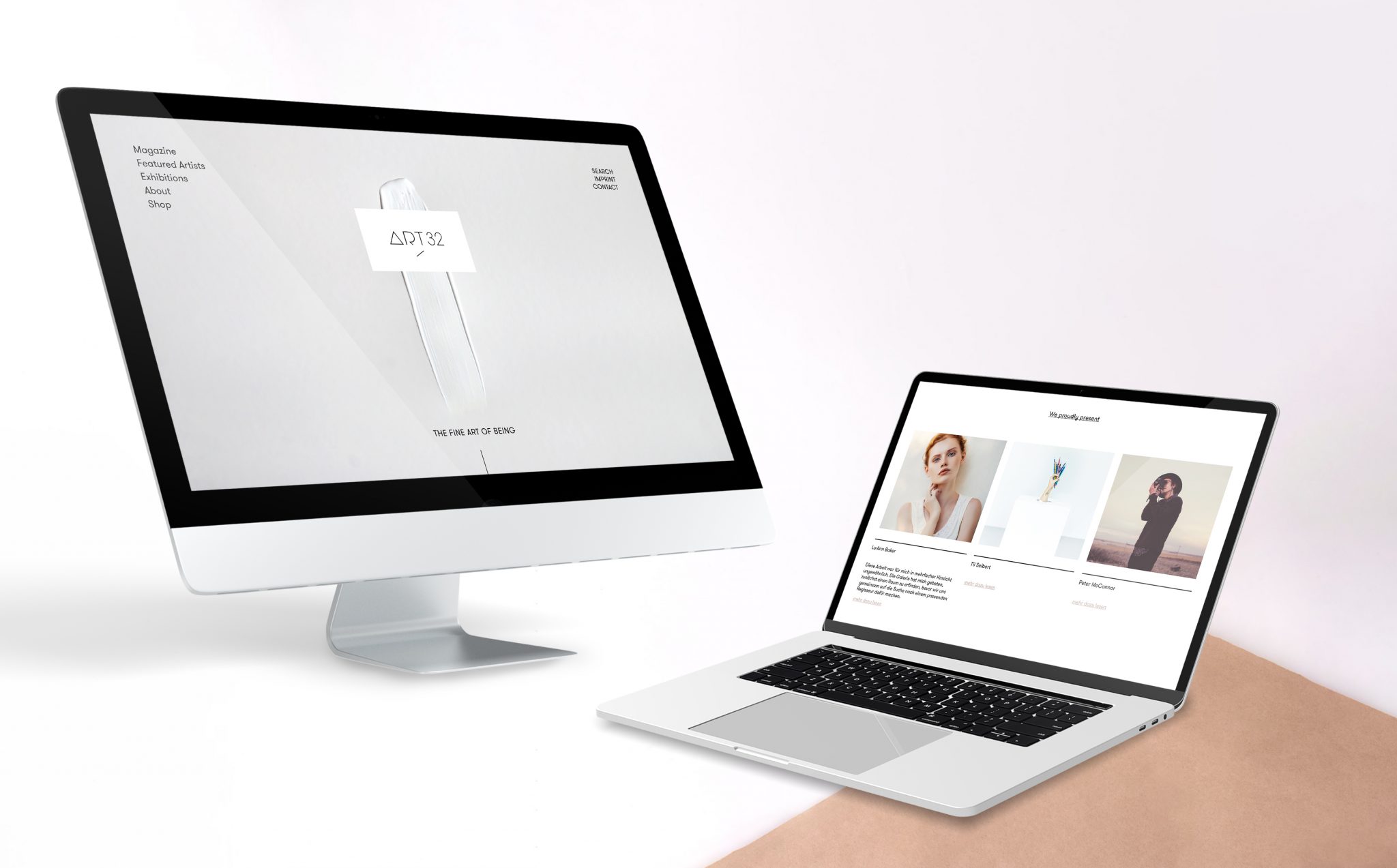
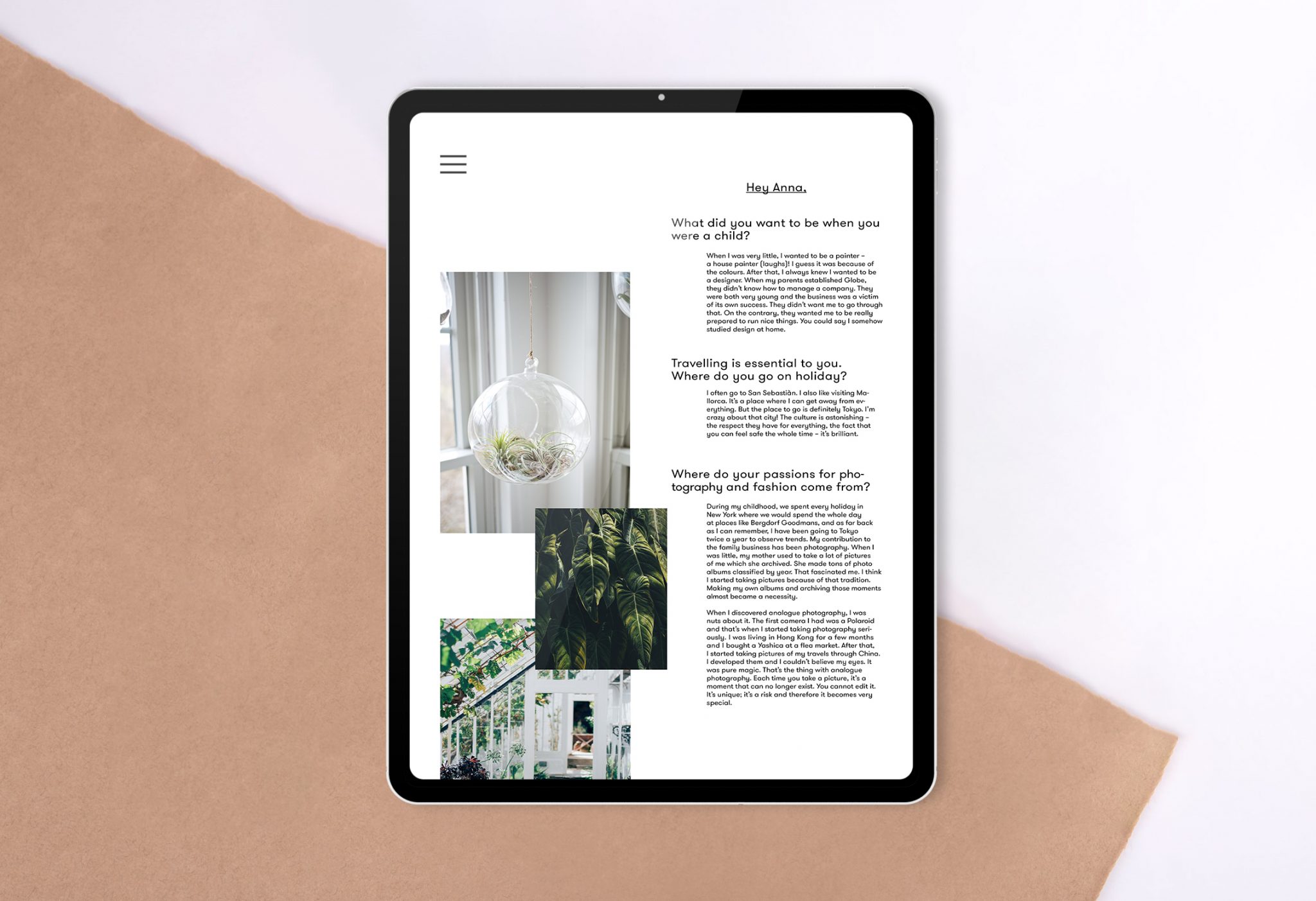
Positionierung, Logo, Claim, Corporate Design, Geschäftsausstattung, Kundenmagazin, Künstlerkatalog, Einladungen, Mailings, App, Website
»Ein Corporate Design für eine
Galerie zu entwickeln ist so, als
würde man Kunstwerken eine
Bühne geben.«
Galerie zu entwickeln ist so, als
würde man Kunstwerken eine
Bühne geben.«
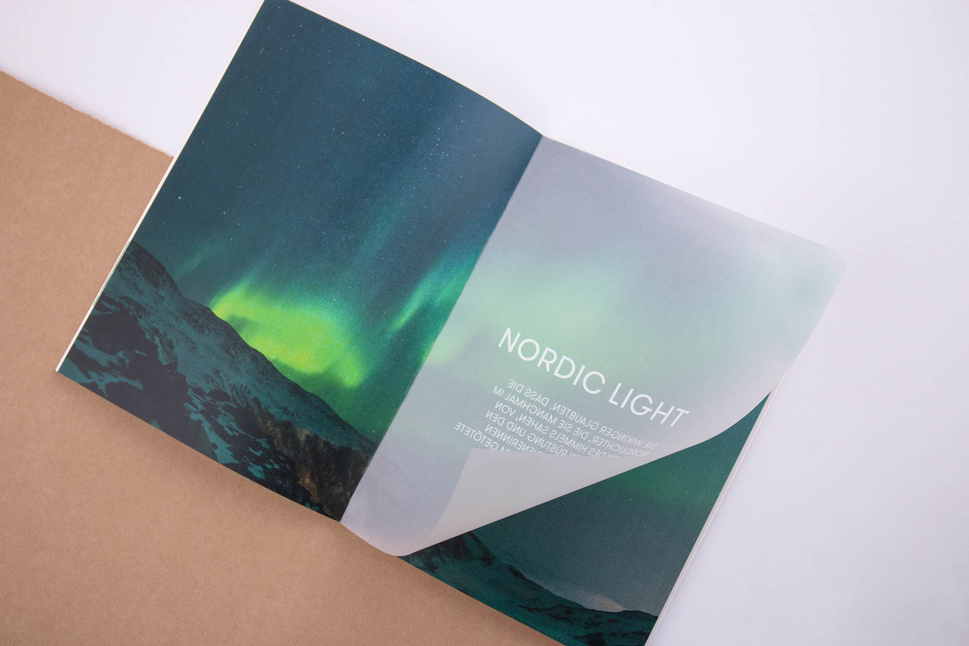
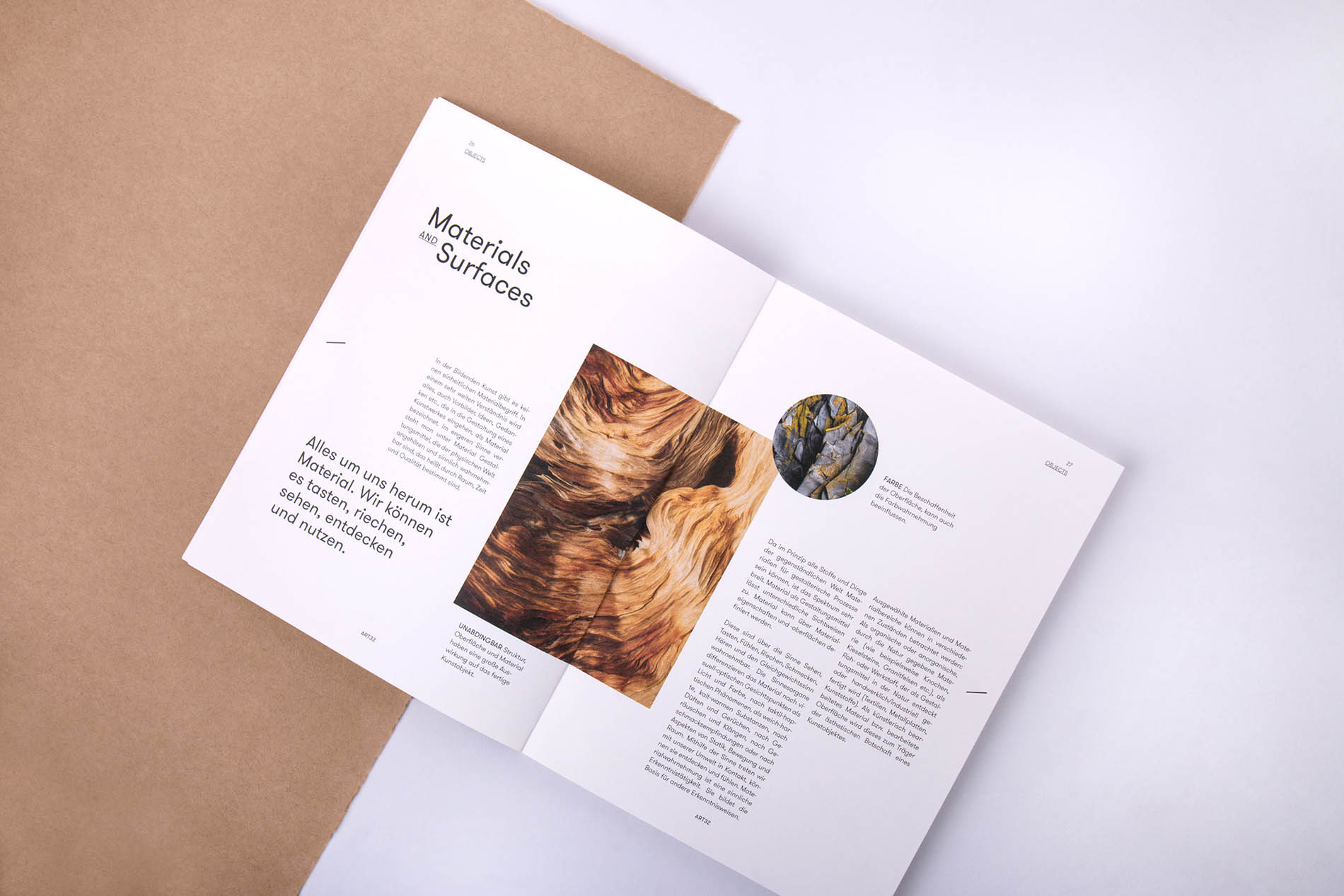
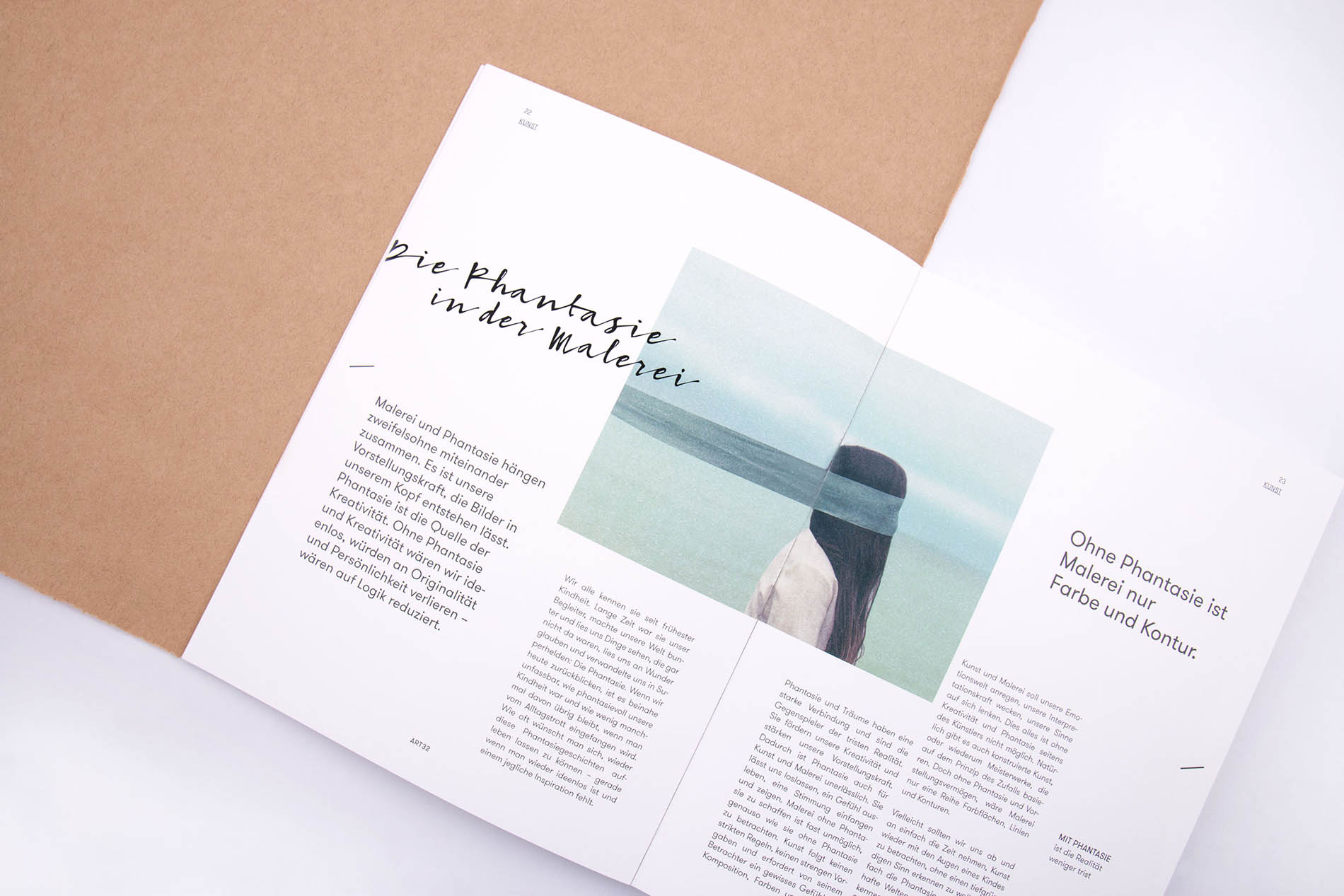
Raum im Raum
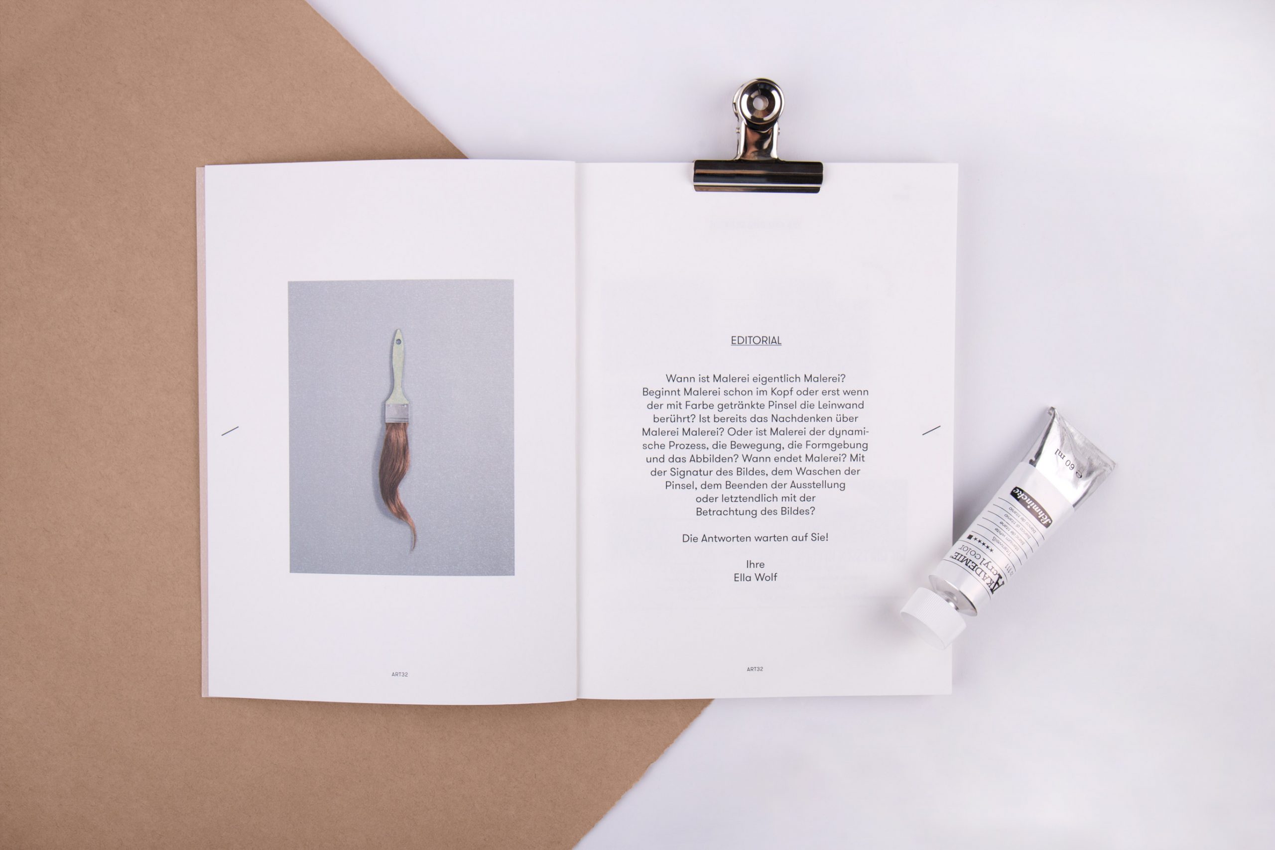
Für uns standen die Künstler mit ihren Werken im Mittelpunkt der Kommunikation. Aus diesem Grund ist das Markendesign clean und zurückgenommen. Es lässt der Kunst den Raum im Raum. Uns war es wichtig, ein offenes Designumfeld zu schaffen, das allem Neuen einen angemessenen Rahmen gibt. Hier kann sich Kunst ganz frei entfalten.
»Wenn Design und Kunst
aufeinandertreffen, ist die
Kunst daran, beiden Disziplinen
gleichviel Raum zu geben.«
aufeinandertreffen, ist die
Kunst daran, beiden Disziplinen
gleichviel Raum zu geben.«
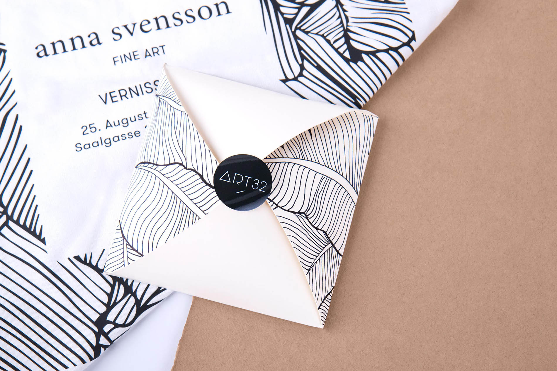
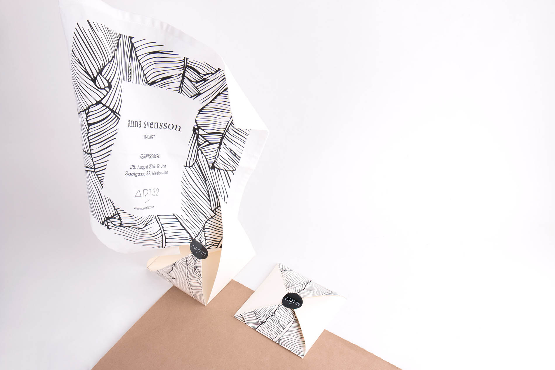
Ein Mailing der besonderen Art: Die Einladung zur Vernissage wurde auf ein eigens gestaltetes Baumwolltuch gedruckt und in einem maßgeschneiderten Kuvert aus Papier mit Baumwollanteil versandt. Ein kleines, charmantes Siegel schloss das bedruckte Kuvert und gab dem Ganzen die individuelle Note.